Corporate Brand Guidelines
Brand guidelines booklet including conceptual data, Verbal information and Visual usage information.
Brand guidelines booklet including conceptual data, Verbal information and Visual usage information.
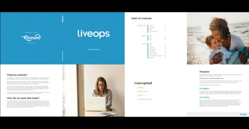
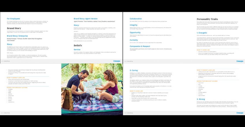
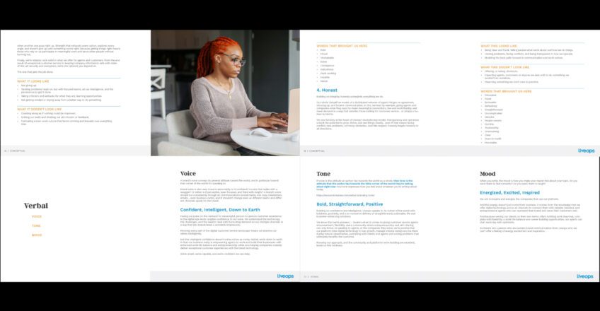
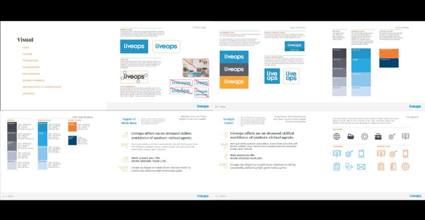
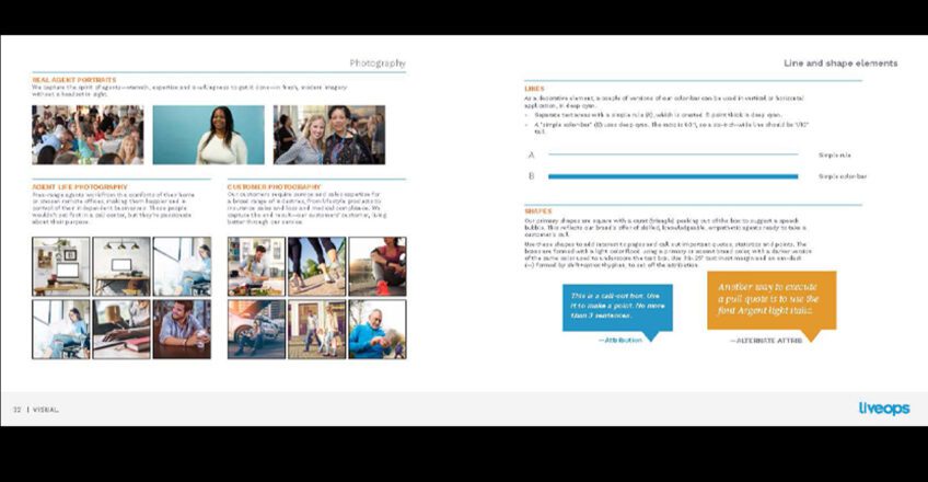
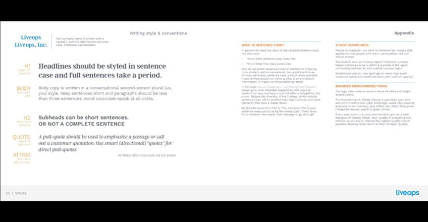
The design of the “Remarkabook” booklet for LiveOps was designed by myself, when I was the Creative Services Manager for Liveops. The booklet was built by Resound Creative, who was helping us with our brand repositioning, and follows a clean, structured, and brand-consistent approach. It uses a vibrant, warm color palette centered around cyan, with accent colors like pumpkin and navy, to create an inviting yet professional tone. The typography is clear, with fonts like Argent CF and Work Sans used across different media, ensuring legibility and consistency. Visual elements like lines and shapes, particularly the speech-bubble-like carats, reinforce the theme of communication. The layout emphasizes clarity, using ample white space and offsetting text with decorative rules or simple color bars. Photography focuses on authenticity, showcasing real people without the conventional headset imagery. The overall design reflects LiveOps’ brand values of flexibility, innovation, and personal connection.